Also known as a "carousel", a Row Slider enables you to create a set of rows that visitors can flip through manually - or you can set them to transition automatically at specific intervals.

How to add a Row Slider
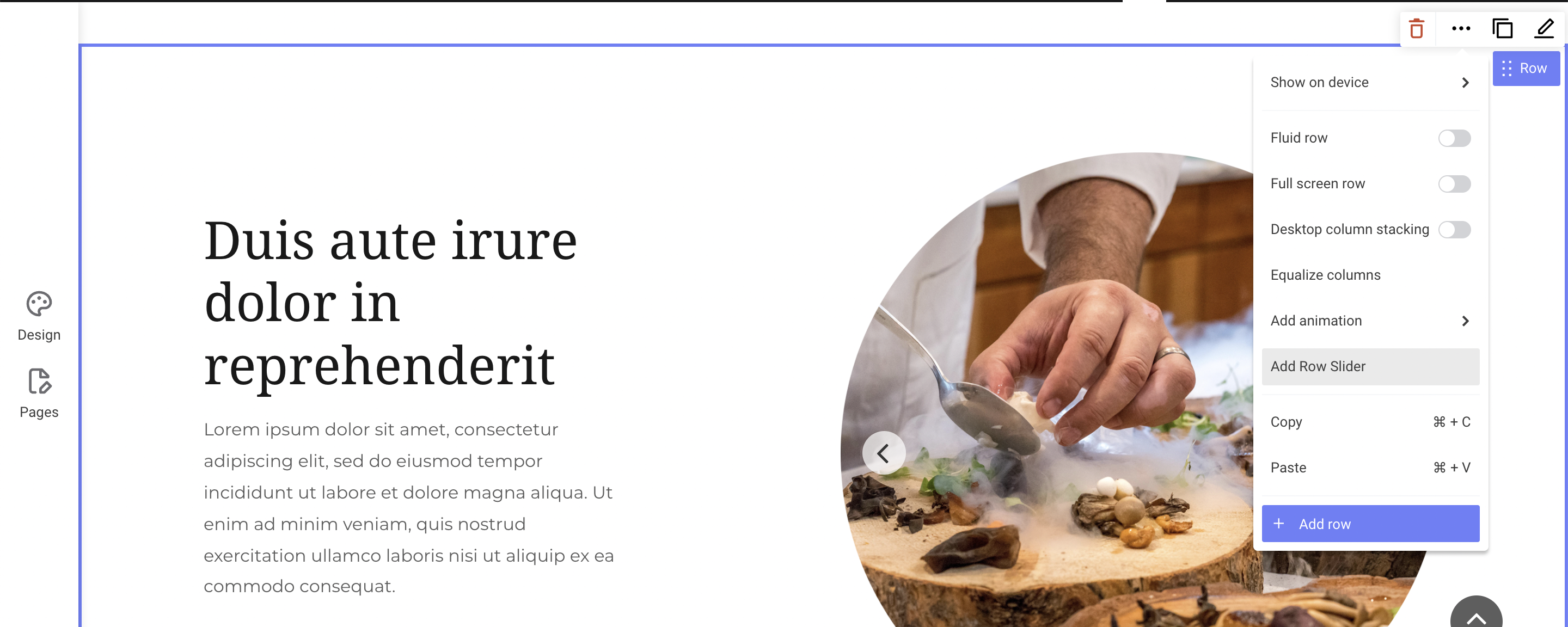
Click on the row you wish to turn into a Row Slider and then click More and select Add Row Slider.

You will now see the Row Slider dropdown option every time you hover on the row.

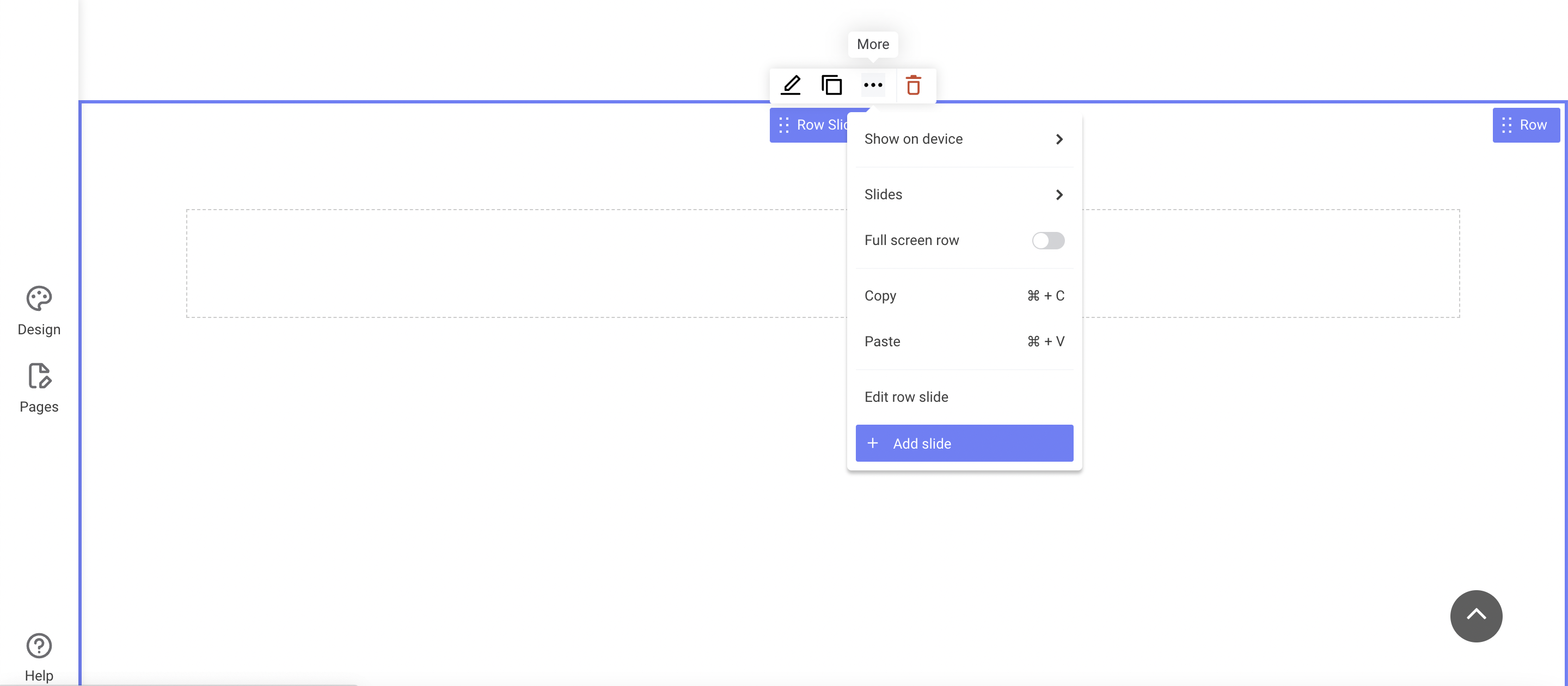
To add more slides to your Row Slider, click Row Slider and then the More icon. Select Add slide.

Row Slider design
Select Design from the Row Slider dropdown menu to start editing the design. When designing your Row Slider, you can customize the background as well as the style of the arrows and pagination dots that visitors can click on to flip through your slides. Be aware that your Row Slider background color/image will only be visible on your website if the rows inside the slider have a margin greater than zero.
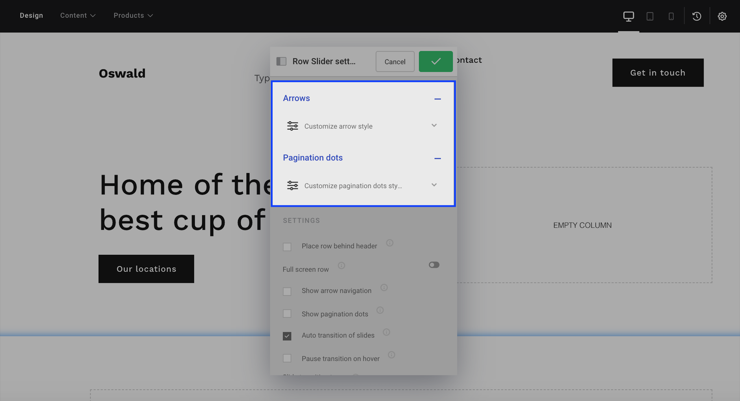
You can customize your Row Slider arrows and pagination dots by navigating to Row Slider > Design > Arrows or Pagination dots. Here you can change sizes, background colors and border properties in various states.

Why can't I see any arrows or pagination dots?
In order for the arrows and pagination dots to show on your row slider, you need to first enable them in the Row Slider settings menu, as described below.
Row Slider settings
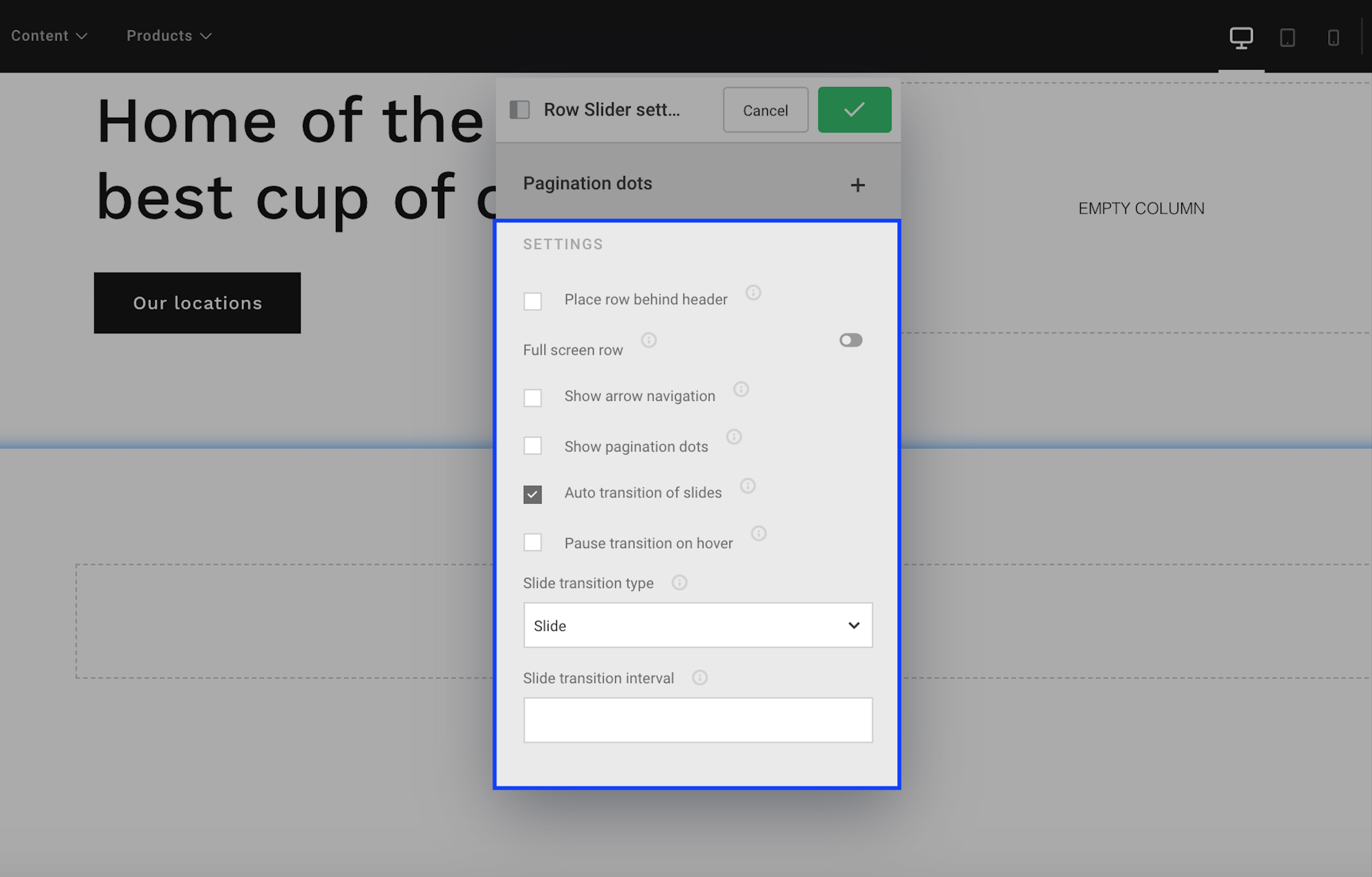
Select Settings from the Row Slider dropdown menu to start editing the settings. In the Settings menu, you'll see the following options:

Place row behind header: move the entire Row Slider with all its rows up behind the header.
Show arrow navigation: if enabled, the navigation between slides of the Row Slider will be done through an arrow on each side, moving the slides on the respective direction.
Example of arrow:
![]()
Show pagination dots: if enabled, the navigation will be done with circles (dots) at the bottom of the row slider.
Example of pagination dots:

Auto transition of slides: slides in your Row Slider will automatically change without the visitor clicking.
Pause transition on hover: if Auto transition of slides is enabled and the visitor hovers on the Row Slider, the transition will pause. Once they hover somewhere else on the page, the Row Slider will resume the automatic transitions.
Slide transition type: define the transition animation for when rows slide from one slide to the next. You can choose between four animations:
- Slide: each slide moves in horizontally
- Slow fade: a gradual, slow transition (with the fade lasting 0.8 seconds)
- Fast fade: a gradual, fast transition (with the fade lasting 0.2 seconds)
- Zoom in: if you have added a background image on the slide, a zoom effect will "move in" on the image
Slide transition interval: by default the transition interval is 5000 milliseconds (5 seconds). Choose a smaller value if you want the transition interval to be shorter and a bigger value if you want the transition interval to be longer. Remember to input the number in milliseconds.